Introduction
Geologic maps are maps that depict the rock units that crop out at Earth’s surface. Typically, they use different colors (or different fill patterns) to distinguish between different geologic units (or formations). Units (members, formations, groups, supergroups, etc.) meet at contacts, which can be of several varieties. To make relationships between rock units more clear, many geologic maps include cross-sections, which show a conceptual “slice” through the Earth along a straight line or multi-segment “polyline” on the map. The patterns that rock units (formations) make can convey key information about the geologic history of a region.
History of geologic maps
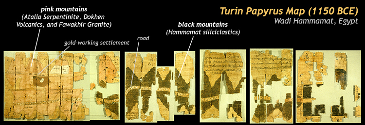
The oldest known use of mapping to depict the distribution of rock types on Earth’s surface was the Turin Papyrus Map, made in 1150 BCE in central eastern Egypt. It shows multiple rock types by virtue of what color their mountainous outcrops appear. Landmarks such as gold mines, shrines, and roads are also shown:
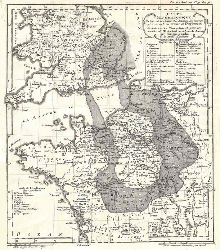
This innovative use of landscape color was forgotten by the time French geologists Jean-Étienne Guettard and Philippe Buache published their map of chalk deposits in 1746. However, it was still an important milestone. This map summarizes in a single image a large amount of geological information about a region. As a matter of historical significance, it shows for the first time the distribution of a single geological unit across space; indeed across multiple countries. In this case, the lumpy gray “doughnut” shape shows the area where surface outcrops of “the chalk” (namesake of the Cretaceous) may be found in France and England. It implies that strata in the “doughnut hole” are younger than the chalk, and strata outside the ring’s periphery are therefore older than the chalk. This map is an important milestone, but it’s not what most geologists would instantly recognize as a geologic map because it emphasizes just one unit, excluding all others, and because it uses only one color.
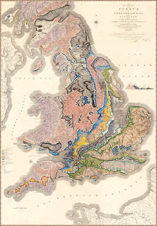
The next step forward was taken in England, where geologist William Smith is renowned among geologists for his achievement of depicting more than one formation in a single map. In fact, Smith depicted a whole country’s worth of formations, and rendered the first ‘modern’ geologic map. He made the decision to represent the surface occurrence of different rock units by depicting them in different colors, a practice that is still used today.
Smith gathered his data through his day job as a canal engineer. His career occurred during the heyday of British canals, and Smith was on the front lines as new trenches were being dug. As excavation revealed rock, he noted whether the strata were sandstone, shale, limestone, conglomerate, or coal. In particular, he paid attention to fossil content such as ammonites, trilobites, and brachiopods. Correlating the strata on the basis of these fossil “timestamps,” he was able to match up outcrops across an entire nation.
His map elegantly summarizes years of field work, and thousands of outcrops into a single picture. It’s a marvelously data-rich image. The dark gray units are the Carboniferous “coal measures.” The luminescent yellow stripe down the middle is a belt of honey-colored Jurassic limestones. Likewise, each other color corresponds to a particular period of geologic time, marked by a single type or rock or group of related strata.
The other important innovation that Smith achieved was to depict a simplified geologic cross section, showing how the various strata related to one another, from the perspective of a “side view” looking north at an east-west cross-section through the entire island.

Though this perspective is impossible to physically achieve in real life, to visualize the cross-section in our imaginations is illuminating; it shows at one glance the overall structure of the island: a series of strata dipping off to the east. It is rather similar to the “layer cake” of the Grand Canyon, but tipped over to one side.
Since Smith’s innovations, geologists have continued to draw cross-sections, and continued the practice of using color (or patterns) to distinguish different geologic units or formations. In the modern day, the National Geologic Map Database provides an elegant visual organization to U.S. geologic maps (although the current map display is Flash-based, so will be incompatible with some browsers). Back in William Smith’s home, the British Geological Survey has a similar browser-map-based database search with their Geology of Britain viewer. Globally, OneGeology offers a global compilation of maps, again with a user-friendly, map-based interface that they call the OneGeology Portal.
Elements of a geologic map
Given that all these maps of all these different places depict a great variety of different rocks, what do they all have in common? In general, geologic maps consist of several key elements, or components. They include:
-
-
- A base map, usually a topographic map of the region. Topographic maps depict the shape of the land using contour lines of a set elevation.
- The usual stuff that goes along with a topographic base map, such as a scale, a reference map, latitude and longitude, and magnetic declination (the angle of difference between magnetic north and geographic north).
- Distinct geologic units, differentiated from one another by some distinction, like different colors or different fill patterns, as well as an abbreviated identifier code. For instance, the Cambrian-aged Weverton Formation might be tan in color, and would be abbreviated ꞒW.
- Contacts between different geologic formations. These contacts might be comformable stratigraphic contacts, unconformities, faults, or intrusions.
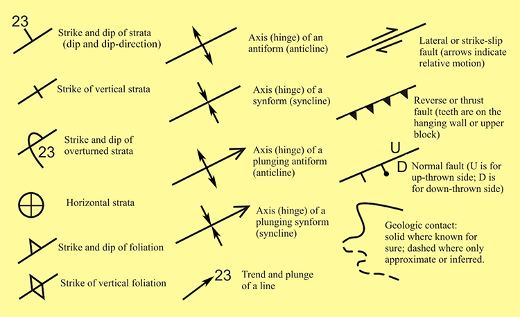
- Symbols showing the measured orientation of rock structures, such as bedding, foliation, and faults.
- Other symbols showing the interpreted structure of the region, such as anticlines, synclines, normal faults, thrust faults, and transform faults.
-
Orientation of structures
Knowing the position of geologic structures is important for geologic mapping. These structures include sedimentary features such as beds, metamorphic features such as foliation, and igneous features such as dikes. Their positions in space can be measured in the field and recorded accurately on the map using symbols and numbers.
There are several approaches to expressing this orientation, but the basics are that we want to (a) describe the position of the structure relative to the compass (north, south, east, west, etc.) — we call this ‘declination’ — and (b) we want to be able to describe how inclined that structure is relative to horizontal (i.e., in reference to the Earth’s surface) — this is its ‘inclination’ or ‘dip.’ We measure the declination using either ‘dip-direction’ or ‘strike.’
Most students find it easier to think about measuring bed orientation in “dip and dip-direction,” but many professors have been trained with “strike and dip.” Let’s briefly examine both.
Dip & dip-direction (vs. strike & dip)
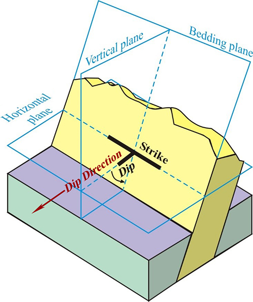
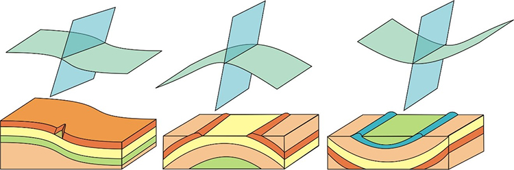
This block diagram shows the relationship of a plane-shaped feature of interest (in this case, a bed of yellowish rock, perhaps a sandstone) with two planes that intersect it: one is a horizontal plane and one is vertical. The line of strike is the intersection between the bedding plane and the horizontal plane. The dip-direction is perpendicular to the strike: it is a line at the intersection of a vertical plane and the horizontal plane. It’s the direction in which the rock dips: if you were to tilt a bottle of water over the outcrop surface, the little stream of water would run downhill in the direction of dip. But which way is that?
Both strike and dip-direction are compass directions, measured with reference to north. They are most efficiently expressed as a three-digit number that varies between 000° and 360°. This is “azimuth notation.” Some geologists prefer “quadrant notation;” to measure east or west of north or south by the appropriate number of degrees and then express that as something like “N40°W,” which would mean “40° west (counterclockwise) from north.” That same orientation could be described in azimuth as “320°” (that is the 360° of true north minus 40°.)
If that sounds confusing, don’t worry: On geologic maps none of those numbers appear. Instead, the orientation of the line of strike is simply shown graphically. Usually “north” is at the top of the map page, so a line running from the top of the page toward the bottom would be a northerly strike. From a north-south strike, the beds could dip either to the east, or to the west. Those are the only two directions that are perpendicular to north. The dip-direction is always perpendicular to the strike. The little dip-tick line (the “stem” of the T shape, jutting out from the strike line at a right angle) shows dip-direction.
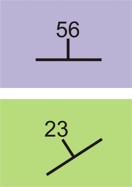
The dip itself is the angle of inclination, measured from horizontal down to the bedding plane. It is most efficiently expressed as a two-digit number that varies between horizontal (00°) and vertical (90°). This number is written at the end of the dip-tick line, as shown here in the two examples of strike and dip symbols as they appear on geologic maps. Note that nowhere is the dip-direction or the strike direction written down as numbers. Instead, they are depicted graphically with the orientation of the T shape of the symbol. The long line (the top of the “T”) is the line of strike. The short line that comes out of it (the stem of the “T”) is the dip-direction. The number at its end is the dip angle in degrees from horizontal.
Folds and faults
Folds and faults are deformational structures, also called tectonic structures. They form as a consequence of tectonic deformation of pre-existing rocks. Where we have tectonic compression, we get folds and thrust faults. Where we have tectonic extension, we get normal faults.
Folds

Rock strata can be folded under compressional stresses applied over a long period of time. Generally, we recognize two major categories of folds, and one minor category: anticlines, synclines, and monoclines. Anticlines and synclines occur together, and share a “limb” in common. Where you find anticlines, you often find synclines, too.
Monoclines are features associated with the adjustment of sedimentary layers over top of basement uplifts. They are folds where the layers go from horizontal (on top of the uplift) to tilted, to horizontal again (next to the uplift). They are reasonably common in the Rocky Mountain west and Colorado Plateau region of North America, but not really anywhere else. Anticlines and synclines, in contrast, have a global distribution anywhere there is a mountain belt.
It’s important to note that just because a fold goes down in the middle (i.e., a syncline), that doesn’t mean the landscape will also go down (i.e., a valley). The land surface’s shape depends on many variables, including the very important role played by the different rates at which different rock units weather.
For instance, Sideling Hill in Maryland is a mountain ridge (a “hill,” a topographic high) but a syncline (a structural low):
It’s only a mountain ridge because the strata at the center of the syncline are quartz-rich and therefore weather more slowly than the silty strata beneath them. The opposite situation is just as common: anticlines with easily-weathered material at the center are etched out so the structural high is weathered out to form a topographic low. Bottom line: There is no guaranteed relationship between the structure of a fold and the shape of the overlying landscape.
Faults
Faults are breaks in the crust along which movement has occurred. There are three main sorts of movement we observe on faults:
(a) the fault plane is dipping at some non-vertical angle, and the upper block of rock has slid down the fault surface under the influence of gravity. The movement is downward along the dip line of the fault, and is called normal faulting. It occurs in situations of tectonic extension, such as at divergent plate boundaries. Low-angle (close to horizontal) normal faulting is called “detachment faulting.”
(b) the fault plane is dipping at some non-vertical angle, and the upper block of rock has moved up the fault surface, getting shoved into position by tectonic compression. The movement is upward along the dip line of the fault, and is called reverse faulting. It occurs in situations of tectonic convergence, such as mountain belts and subduction zones. Low-angle (close to horizontal) reverse faulting is called “thrust faulting.”
(c) the fault plane is vertical, and the two blocks of rock move laterally past one another in opposite directions. These are “strike-slip” faults, and they occur at transform plate boundaries. All the slip is parallel to the strike of the fault. Strike-slip faults can be either right-lateral or left-lateral. If you imagine standing on one side, and looking across the trace of the fault at the opposite side, and the rock over there looks like it’s moving to the left, then the fault is left-lateral. To an observer on the opposite side, it will look like you are moving to their left!
The map’s “explanation”
It’s not a “legend.” It’s not a “key,” though those are common terms for similar features. On a geologic map, we call the area where the various units are named, described, and their colors and symbols defined by the name “explanation.”
Consider this example, which is a close-up look at one of the different units depicted on the geologic map of Pennsylvania: Ss is the symbol for the Shawangunk Formation, depicted on the map in a dark brown color. You can read a description for the formation, including its four sub-units, called members, as well as the other geologic formations with which they have been correlated (and scroll around to see a few more examples):
Berg, T.M., Edmunds, W.E., Geyer, A.R., Glover, A.D., Hoskins, D.M., MacLachlan, D.B., Root, S.I., Sevon, W.D., and Socolow, A.A., 1980, Geologic map of Pennsylvania (2nd ed.): Pennsylvania Geological Survey, Map 1, scale 1:250,000. Explore more here and here.
Various abbreviations are used for the various named portions of geologic time:
| Geologic time unit (era or period) | Abbreviation | Geologic time unit (era or period) | Abbreviation |
| Archean | A | Pennsylvanian | PP |
| Paleoproterozoic | X | Permian | P |
| Mesoproterozoic | Y | Triassic* | TR |
| Neoproterozoic | Z | Jurassic | J |
| Cambrian* | Ꞓ | Cretaceous* | K |
| Ordovician | O | Tertiary* (archaic) | T |
| Silurian | S | Paleogene | Pg |
| Devonian | D | Neogene | Ng |
| Carboniferous* | C | Quaternary | Q |
| Mississippian | M |
* A few of these are a little confusing: Carboniferous got the “C” first, so Cambrian got a C with a slash through it, “Ꞓ,” and poor Cretaceous was stuck with “K.” As far as Ts go, Tertiary got the T first, which left Triassic to be symbolized with a T that had a subsidiary R coming off its stem. However, when “Tertiary” was officially stricken from the ICS geologic timescale in 2003, to be partially replaced by the Paleogene, that freed up the solo T, which is now officially designated as symbolizing Triassic. However, a lot of old maps use “T” to mean Tertiary, not Triassic. So that’s confusing! There were already a bunch of Ms and Ps by the time it came to subdivide the Proterozoic, so that’s the reason for the random X, Y, and Z there.
Various symbols are used to show all these features on the geologic map:
Examples to help train your eye
Horizontal strata
When strata are horizontal, you only see the top layer unless erosion has cut down through it (in stream channels, say), exposing deeper layers. The overall pattern is that the geologic contacts follow the contour lines, and don’t vary much in elevation. In areas of dendritic drainage, such as the Atlantic Coastal Plain, the Great Plains, or the Colorado Plateau, this produces a distinctive branching pattern to the geologic map, as in these two examples:
Bick, K.F., and Coch, N.K., 1969, Geology of the Williamsburg, Hog Island, and Bacons Castle quadrangles, Virginia: Virginia Division of Mineral Resources, Report of Investigations 18, scale 1:24,000. Explore more here.
Sawyer, J.F., and Fahrenbach, M.D., 2011, Geologic map of the Lemmon 1-degree x 2-degree quadrangle, South Dakota and North Dakota: South Dakota Geological Survey, Geologic Quadrangle Map GQ250K-1, scale 1:250,000. Explore more here.
Angular unconformities
Angular unconformities are as distinctive on geologic maps as they are in cross-section: two sets of formations meet each other at an abrupt angle. The lower, older formations will typically be folded or tilted, while the upper, younger formations will typically be close to horizontal.
Haley, B.R., Glick, E.E., Bush, W.V., Clardy, B.F., Stone, C.G., Woodward, M.B., and Zachry, D.L., 1993, Geologic map of Arkansas: U.S. Geological Survey, scale 1:500,000. Explore more here.
Folds
So how do you recognize anticlines vs. synclines on geologic maps? There are two main techniques: (1) look for strike and dip symbols, and (2) look for age patterns. In an anticline, the strata dip outward away from the axis (hinge) of the fold. The anticline’s oldest strata will appear in the middle, and younger strata will appear on the limbs. In a syncline, the strata dip inward toward the axis (hinge) of the fold. The syncline’s youngest strata will appear in the middle, and older strata will appear on the limbs.
When a fold plunges into the Earth at some angle, its outcrop pattern changes from a series of parallel stripes to a series of nested “V” shapes. As with non-plunging folds (those that have horizontal hinges), in a plunging anticline, the oldest strata are in the middle, and the strata dip outward on the two limbs. And as with a with non-plunging synclines, plunging synclines also have the oldest strata on the limbs, and the strata dip inward toward the youngest strata in the middle.
In this example, you can tell it’s an anticline, because it has older strata in the middle (Devonian, D) and younger strata on the limbs (Mississippian and Pennsylvanian, M and PP):
Berg, T.M., Edmunds, W.E., Geyer, A.R., Glover, A.D., Hoskins, D.M., MacLachlan, D.B., Root, S.I., Sevon, W.D., and Socolow, A.A., 1980, Geologic map of Pennsylvania (2nd ed.): Pennsylvania Geological Survey, Map 1, scale 1:250,000. Explore more here and here.
In contrast, here (same map, different fold), you can see the pattern is reversed. This allows you to deduce that it’s a syncline, because Mississippian strata are the middle (younger) and Devonian and Silurian strata occur on the limbs of the fold (older).
Berg, T.M., Edmunds, W.E., Geyer, A.R., Glover, A.D., Hoskins, D.M., MacLachlan, D.B., Root, S.I., Sevon, W.D., and Socolow, A.A., 1980, Geologic map of Pennsylvania (2nd ed.): Pennsylvania Geological Survey, Map 1, scale 1:250,000. Explore more here and here.
In this example, you can see the strike and dip symbols more or less parallel to the contacts between the beds, and dipping westward on the west limb, and eastward on the east limb. This tells you it must be an anticline:
Reynolds, M.W., and Brandt, T.R., 2006, Preliminary geologic map of the Townsend 30′ x 60′ quadrangle, Montana: U.S. Geological Survey, Open-File Report OF-2006-1138, scale 1:100,000. Explore more here.
Faults
Here are two examples showing normal faults…
The first one is marked with D/U notation showing which side went down and which went up:
Wilson, E.D., Moore, R.T., and Cooper, J.R., 1969, Geologic map of Arizona: Arizona Bureau of Mines, scale 1:500,000. Explore more here.
…And this one shows the alternate style, with a little dip-tick coming off the fault trace, on the down-dropped side. Sometimes, as with this example, the mapmaker puts a little “ball” at the end of the tick-mark, making it look like a lollypop:
Wolfe, E.W., and Morris, Jean, 1996, Geologic map of the Island of Hawaii: U.S. Geological Survey, Miscellaneous Geologic Investigations Map I-2524-A, scale 1:100,000. Explore more here.
With thrust faults, a saw-toothed pattern is used. The little triangular “teeth” are on the upper block of rock. There are a lot of examples in this map!
Mudge, M.R., 1972, Pre-Quaternary rocks in the Sun River Canyon area, northwestern Montana: U.S. Geological Survey, Professional Paper PP-663-A, scale 1:48,000. Explore more here.
Structural domes & basins
Unlike anticlines and synclines, structural domes and basins are areas where the strata are flexed around a central point, rather than a line (fold axis or hinge). In map view, they appear like “bull’s eyes” with a series of concentric rings of strata. If the strata dip outward away from that central point, then it is a structural dome. Structural domes expose their oldest strata in their center, while strata get younger toward the outer edges of the structure. The reverse is true for structural basins: they are structurally lowest in the middle, so all the strata dip inward toward that “deepest” part of the structure. This means that structural basins expose their youngest strata in their center, while strata get older toward the outer edges of the structure.
Here is an example from Utah: the San Rafael Swell is a structural dome. If you zoom in, you’ll see the pale blue strata exposed in the middle are Permian, with strata getting younger (Triassic, then Jurassic, and then Cretaceous) as you work your way outward toward the edges.
Hintze, L.F., Willis, G.C., Laes, D.Y.M., Sprinkel, D.A., and Brown, K.D., 2000, Digital Geologic Map of Utah: Utah Geological Survey, Map 179DM, scale 1:500,000. Explore more here.
Another example, of the opposite situation: here, in northern New Mexico, is a structural basin, with the youngest strata (Tsj) is surrounded by progressively older and older strata (Tn, Toa), into the Cretaceous series (they start with K):
Anderson, O.J., and Jones, G.E., 1994, Geologic map of New Mexico: New Mexico Bureau of Mines and Mineral Resources, Open-File Report 408, scale 1:500,000. Explore more here.
As a friendly reminder, the 1746 Guettard / Buache map of the chalk outcrops around the Paris Basin was another example of a structural basin.
Now that we’ve covered these basics, it’s time to test yourself…
Practice
To hone your skills with geologic maps consider these three problems, take this self-quiz (5 questions):
Geologic map self-quiz
Test your understanding of basic geologic map patterns with a handful of questions.
Conclusion
Geologic maps are vital representations of the surface outcrop patterns of geologic formations. To those who master the skill of reading them, they quickly and efficiently communicate a wealth of information about the types and ages of rocks found in an area, whether they’ve been subjected to tectonic stresses, and how they control the landscape.